I’m obsessed with this ligature. The kerning issues putting a capital ‘L’ next to a capital ‘A’ is always a tricky proposition. The branding on Vila 953 from Kobu is one I wish I had in my portfolio.
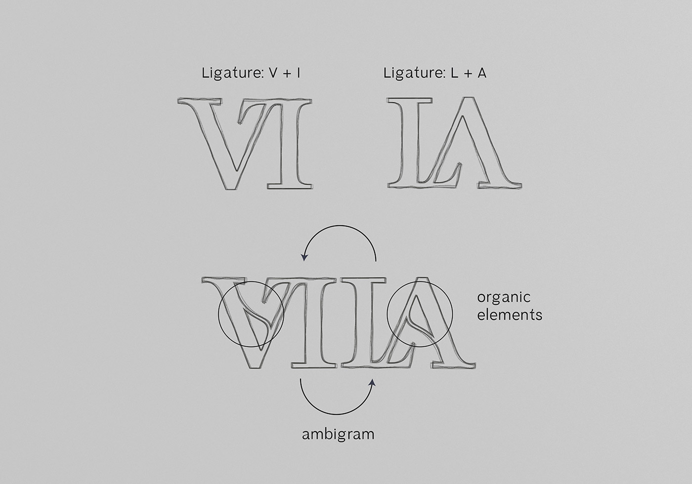
I’m obsessed with this ligature. The kerning issues putting a capital ‘L’ next to a capital ‘A’ is always a tricky proposition. The branding on Vila 953 from Kobu is one I wish I had in my portfolio.